

RIBBON2005
A ribbon that joins "Knowing" and "Sensing"
Art exhibition venue composition (Graz)
A ribbon that joins "knowing" and "sensing"
Condition: Design as a Solution
The goal of providing a solution for a given set of conditions applies equally to exhibition design and architectural design.
There is more than one way of doing this. One aspect of evaluating a design is to determine the method selected and how the given conditions have been addressed.
For example, if there was a need to "do something with the small space," then anybody could come up with the solution "make the space larger."
Another possible solution is that, as the space is small, to make the actual space even smaller and instead design the space in a way that enables the movements of the people in that space to appear beautiful. This space refers, specifically, to the chashitsu or tea ceremony room or house.
It is this reverse solution that is, in fact, the more elegant solution. There is more than just the one solution - "small space -> larger space.
" The reverse solution of "small space -> an even smaller space" is a paradoxical solution - there is less space and yet it is comfortable (although this is not a technique that can necessarily always be applied)
This represents a leap in the thought process and it is learning from this that generates the power to inspire designers to come up with solutions to other issues or challenges as well.
This is only one example, but arguably, outstanding design is the result of coming up with solutions in the most unexpected of ways.
(Whether that solution makes your heart flutter is another standard of evaluation)
So what were the conditions that were posed in the design of this exhibition ?
When I was a student, Peter Cook — one of the designers of the Kunsthaus — and the members of Archigram were the coolestarchitects. Back in those days when I believed that an architect's role was to design an actual building, these individuals were the veryfirst "media architects" in the world who proved that it was not necessary to create something real and who emphasized that it was more important to be able to "move" the world than simply to build.
This was over thirty years ago, and I would like to congratulate Peter from the bottom of my heart on the completion of his very first work.
As I am an architect, I usually find myself being given various directions by my clients when it comes to design.
Regardless of how well known the architect is, it is only normal for the client to discover dissatisfactions when the work eventually goes into use.
One of the reasons for this is that the person with whom the initialdesign-related discussions were held is often not the same as the person/s or organization that will be actually using the building after its completion. If the organization is simply told to use the facility when it has no idea what kind of demands and requests were made during the design process or of the nature of the process that resulted in the building they are using, then it is only natural that the people in the organization would question many aspects of the final result.
Even if the architect endeavors to satisfy the demands of the client during the design stage, the persons using the end-product are dissatisfied. This is, in one sense, the fate of the architect.
(However, there are happy instances when this is not always the case.
This is when the client understands the aim of the design and the facts are conveyed to the successive maintainers and custodians so that the work continues to be cherished.
"Love" always conquers any problems. For me personally, Aoyama Technical College is one such example. Completed in 1990, it always looks fresh and newly completed thanks to the "love" shown for the architecture by its owners)
In this essay, I shall place myself in the unusual position of "the user" or the client.
It is not a bad thing to switch one's role from time to time.
And what is the Kunsthaus like when examined from the point of view of the user ?
I would first like to express my respects to the city of Graz for making the courageous decision of choosing - through a competition - this design. The resultant work has been described as a friendly alien from outer space that has landed in a beautiful ancient city. Although the architecture is completely foreign to the surrounding streetscape, its form and texture is like that of a soft-bodied creature that flows between and spreads out from the rugged peaked buildings and yet it is not in conflict with its surroundings and if anything, is quite integrated (although some would no doubt disagree).
The clear lack of compromise is like a breath of fresh air. Obviously, the preservation of the streetscapes of ancient cities is important, but the significance of this work lies in the fact that it proves that there is never only one way of preserving the old.
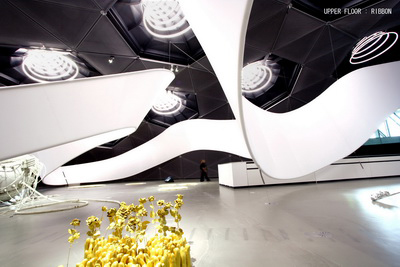
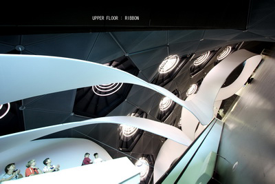
The main exhibition rooms are on two levels. The upper level has a high, protruding ceiling that conforms with the external roofline, while the lower level is flat. The ceiling of the upper level is dotted with skylights and large multi-ringed light fittings that draw the attention of visitors even when the lights are out. There is a moving ramp (another bold choice) that runs through the middle of the exhibition room and the positioning of the works would require some consideration in order to achieve a sense of cohesiveness of the exhibition space as a whole. Rather than the smooth acrylic material used on the exterior, grey paint has been used in the internal space, which further enhances the skylights and the large light fittings on the ceiling.
One way of addressing these issues would be to wrap the interior with screens, but this would not be making the most of the building's internal space and form. To make the most of the features of a building and at the same time to find a way to address any issues or challenges is not an easy task.
I was asked by the supervisiting curator of this exhibition, as well as by Kunsthaus Graz director, to come up with a new exhibition design that would enhance the features of this architecture.
Something that appears closed and is yet open:
a ribbon flowing in the wind / sprung-open DNA
Another condition is posed by the exhibits themselves.
One of the aims of this exhibition is for photography, art and media to be handled in the same way.
Post-processing of digitized photographs is in fact quite similar to painting while photography is commonly used in art, and today, the boundaries between media art and "just art", without a prefix, are no longer clear.
However, when asking what they do, a photographer will answer "photographer" while an artist answers "artist". They seem the same and yet they are not. Therefore, what type of ordering and layout would be appropriate for this exhibition in which the various media are all treated as one ?
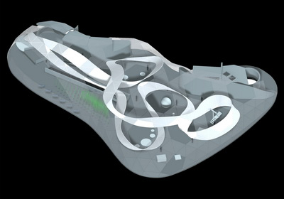
I therefore categorized the work based on the "format" of each work. The result was to place the "objects" or three-dimensional works on the upper level with its larger space and the two-dimensional works on the lower level with its flat ceiling.
"Objects" were defined as "three dimensional, externally shaped works", while "flat" works were defined as "two-dimensional, flat screened" works. As a result, moving images, photographs and paintings are all exhibited on the lower level as they all have the same format, that is, they are all flat.
Although there is no particular significance in categorizing art by its form, neither is there any definitive standard for categorizing art.
In this case, the "format" - the hardware of the work - was chosen in order to fit into the hardware "format" of the exhibition space.
This concept of dividing the upper and the lower levels developed as a result of group consensus between the six members of the planning team including me.
Walls are often used to divide an exhibition space, partly to avoid interference amongst artists. This applies obviously not to solo exhibitions but to exhibitions like this one in which the work of many artists is on exhibit. However, if rooms are created from an exhibition area of this size, the manner in which the building expands -– a feature of this art museum – would be lost. (Here, too, I wanted to respect the intention of the "designer")
And yet, if the works were simply exhibited indiscriminately within a single space, there would be the danger that it would end up looking like display shelves in a supermarket (although this could also be interesting).
For this exhibition, therefore, I tried to come up with an exhibition space that was not closed nor totally open nor a choice between the two.
This is how the "conditions of the space" and "the conditions of the works" came together.
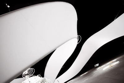
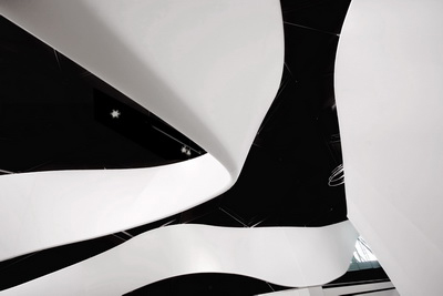
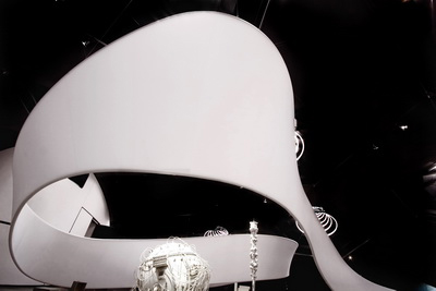
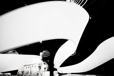
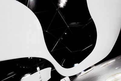
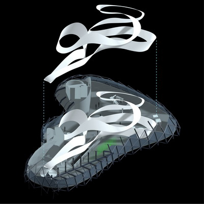
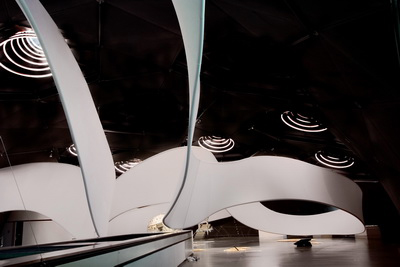
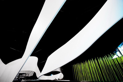
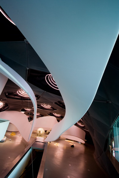
The solution for the upper level, which represents an integration of all of these, was the creation of a space that featured a single, continuous screen.
In some places this screen rises up from the floor to indicate the artist's "territory" while in other places it lifts up into the air to form a canopy that floats to indicate circulation routes.
This flowing movement reinforces the characteristics of the internal space. It has a strength that reduces the presence of the skylights and the light fittings on the ceiling and at the same time has a softness that does not obstruct the works. I presented, as a design solution, an overall space that featured this changing ribbon-like screen.
This design also represents the incorporation of another structure into the architecture.
There is a link between this "fluid space comprising a series of curved forms" and Web Frame at the Iidabashi Station on the Oedo Subway Line (2000, Tokyo).
In Web Frame, a secondary structure created from rod meshing travels underground, embracing the space. A computer program to produce a design that would satisfy the requirements of the project and the intentions of the designer was developed for this work.
Web Frame represents the realization of (probably) the first example of architecture in the world that was created by utilizing a computer program that "satisfied the necessary conditions and requirements." Although a similar program was not developed for the Graz exhibition, there are similarities between the two designs in the way issues were resolved.
The way the ribbon flowed through the space and the shape that was selected was not something that was done spontaneously.
The ribbon took shape (and beautifully so) by addressing certain requirements and conditions represented by the restrictions posed by the width and twists of the ribbon, by the need to situate the ribbon close to the ground around each work to indicate boundaries, and by the need to have it rise high up in the air to create passageways for circulation routes.
Web Frame necessitated a computer program in its design as these requirements and conditions became entangled to such an extent that solving these was beyond the ability of the human brain. Mesh can be joined to form any shape and has a high degree of flexibility but because of these very features, it is equally difficult to come up with solutions to the conditions posed in the design.
As the Graz version is a single continuous surface and there has little flexibility, the requirements and conditions can be solved by the human brain.
The result is a ribbon that dances in the air, propelled by the wind.
The space created by the ribbon that rises up like a wall and traverses the space above like a roof contracts in some sections, expands in others, is segmented or can be continuous.
The appearance of this supple and fluid form resembles that of a living organism.
Speaking of living organisms, the shape of the Kunsthaus is reminiscent of a single-cell creature such as a paramecium. When the nucleus of the paramecium is sliced open with a scalpel, the DNA's double-helixed ribbon that is folded up inside springs open, filling the cell (to be confirmed).
Perhaps it is the opened-up state of this DNA that is the basis of the design for this exhibition.
A small town / architecture that moves:
The wall as maternal presence
The lower level is in sharp contrast to the upper level.
The lower level features photographic work, flat or two-dimensional art and moving images. It was decided that a "flat" method of exhibiting the works should be used for flat or two-dimensional work. The initial plan was not to have any walls, and instead I came up with a way of exhibiting the works so that they appear to be floating in the air.
After talking to the artists, however, I realized that they in fact wanted walls. Hidaka Rieko said she wanted a sturdy wall, while Sugimoto Hiroshi wanted a tunnel-like narrow and long space. This was totally unexpected.
When going back through history, flat or two-dimensional art which was born from murals that were part of buildings, can be seen to be later liberated from the constraints of the building by becoming a single tableaux, and should, by rights, have been further liberated from the constraints of the frame. Two-dimensional work appears, however, to continue to recall its origins, still seeking a wall that will embrace it, a place where it can feel safe and secure – an almost maternal presence.
The biggest condition imposed on architecture is the land.
The architect cannot choose the site, nor can the building avoid the issue of land or gravity
(By the way, amongst Archigram's famous projects is a work titled Walking City. The walking city or the moving structure is the embodiment of our desire to get away from land, the strongest constraint in the history of architecture)
Architecture - bound by the overwhelming ties of "the land", seeks to leap up and then float in the air and without getting its legs caught below, while art opens up its imagination in a free world only to ground itself by seeking the foundation that is "the wall". The similarity and the disparity between the two are certainly interesting.
To the architect, the "wishes" of the artist are no different from the "design conditions" imposed upon a building.
(Once again I am changing roles – this time I am not the User but the one who responds to the User's demands).
In accordance with the wishes of the artists, therefore, I decided to build walls.
The wall sought by each artist was different. Some wanted a thick wall, some wanted a small wall, some wanted a soft wall, others a dark wall.
If I were to listen to each artist's requests, the result would be a small room for each artist. As each artist's request concerned "the interior of the room," the exterior is therefore "a result" of the interior.
In this town, the exterior was simply a "result" of the interior and the "architecture" was never "designed" as such. Unlike conventional towns, this is a town that was created from the inside.
The feature of the works on exhibit on the upper level is that they all - some more than others - stimulate our senses. These are sensory objects that are yet to be bleached or decolorized.
Ribbon acts here like a bandage or a wrap for a baby, nurturing and healing the vulnerable objects as it holds and binds them, fluttering and wavering in constant and never-ending invitation.